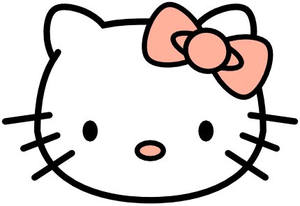
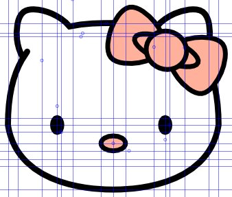
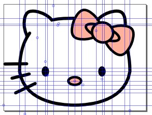
Wednesday, November 24, 2010

How to make a blog background - Pimp your blog Part I

Paper texture for a blog.


http://mckayhead.blogspot.com/2010/11/creating-business-card-using-inkscape.htmlNow that I am getting somewhat serious about blogging, I figure I might as well have a blog that looks somewhat decent. The background sets the tone for your entire blog, so this is my first step.

The look I am trying to go for is kind of a geeky designer look.  I have kind of been liking the grunge look recently and think I want to go for something similar to what I did with the business card tutorial

Step 1: Get your texture

I am going to use a paper texture.  I will be setting this up in Inkscape and use this for the basis of my blog.


The texture is good by itself but I want to dilute it a bit. Create a separate layer to create an overlay.


I used a tan color then put the layer blend mode to screen.

Create another overlay that is black. Add a radial gradient. Blur it a bit.

That is it. A nice paper texture background for the blog!

Paper texture for a blog.

How to Draw Hello Kitty

Hello Kitty!


So the last post I did was drawing a pumpkin.  I am not too happy with that so I wanted to get something new up quick.  Being in a somewhat Asian mood this morning, I decided a nice simple project would be to use Inkscape to draw Hello Kitty.

Because of the simplicity of the Hello Kitty shape, I will make this more of a beginning tutorial and focus more on the technicalities rather than the principles.

Step 1: Setup the page
Open up File>Document Properties.  Change the units to px and change the document to be 400px wide and 300px tall.

Hello Kitty is pretty precise as an image, but all of the images are non standard. We could try to guess the shapes but we may as well do it right and get everything exact using guidelines.  This turns out to be a beast of work

This tutorial is going to be super heavy using guidelines and exact dimensions for shapes.  If technicality is not your thing, you may not want to endeavor on this project.

Step 2: Setup the guidelines

Yep; that is right.  That is a plethora of guidelines. We need them all to make Hello Kitty as exact as possible.  Here you see three main groups of guidelines. The main one on the page is for the head, then next (group to the right) is for the bow, and the final grouping with angled guidelines is for the whiskers.

To bring out a guideline, you simple click outside the drawing canvas where the ruler is and drag onto the canvas. Click on the top for horizontal guidelines and click to the left for vertical guidelines.

Here is what we need:
Horizontal Guidelines - 11
Vertical Guidelines - 22
Diagonal Guidelines - 2

Drag them anywhere just to get them out.
Once all the guidelines are on the screen, let us place them more precisely.
Double click on a guideline and it will give you options to make them more exact.

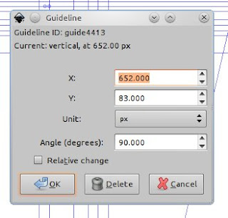
This is what the dialog box looks like when you double click on a guideline.
For the horizontal lines, enter the following coordinates (note: just edit Y coordinates for horizontal lines):
260, 245, 240, 120, 110, 100, 83, 72, 60, 50, 15

Vertical lines (X coordinates only):
45, 60, 95, 117.5, 123.5, 140, 182, 200, 218, 260, 276.5, 282.5, 305, 340, 355, 508, 530, 580, 610, 630, 652, 940

Diagonal lines (all coordinates must be exact):
X= 94, Y = 83, Angle = 77 | X =955, Y = 190, Angle = 102

Sorry....  that was no fun.  Good part is that boring stuff is over. Now with everything set up, things should go pretty smoothly.

Step 3: The Head

Use the Bezier pen tool to make the basic shape. Set the stroke width to .25
Use the picture below as a reference to where your points should snap.
Once you have completed the shape, use the node tool to select the shape. Start dragging the sides to form the shape of the Hello Kitty head.

Now snap the nodes to the guidelines.  Look for the yellow circles I added to help you know where you need to place the curve nodes.

Step 4: The Ears

For the ears, we will use the Stars and Polygons tool.  With that tool selected, use the following settings: Corners = 3, Spoke Ration = .815, Rounded = .3 Randomized = 0.
You still want the stroke width to be .25

Use the picture as a guide where you need to snap the points of the star (ear).  The green circle is where you need to start, the red circle is where you stop.

Now we need to join the ears with the head. To do this, highlight one of the ears, then highlight the head while holding the shift key.  Then apply Path>Union (CTRL + SHIFT + +).  Repeat for the second ear.
Now use the node tool and break apart the nodes where the bottom of the ear meets the head.  Grab the line from the head and move it up a bit (as shown below).

Make the end cap rounded.

Step 5: Eyes

Use the circle tool.  Make sure width is still on .25


Colored dots indicate where to start and stop. Hold shift while drawing the circle.  Fill the new circle black.

Step 6: Nose

Change the circle width to .2 and draw the nose.  Hold shift while drawing.
Fill the nose with a pink color.

Step 7: The Bow

Move over to the next area (to the right) of guidelines to do the bow.

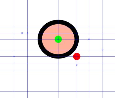
Add a circle holding shift.

Create a circle on top of that (holding shift).

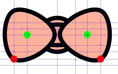
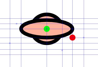
Use the star tool to make two shapes for the bow.

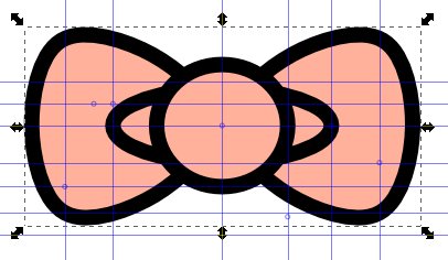
Change the order of shapes so it looks like a bow.

Group the shapes together, rotate them, then place it over the ear.

Step 8: The Whiskers

Move over to the last section of guidelines.

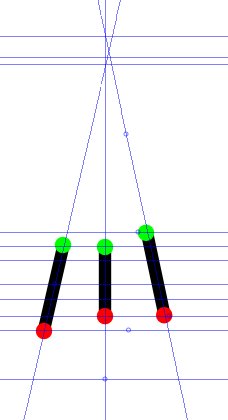
Use the bezier pen tool to make the whiskers. Make the stroke width .25 and make the caps rounded.

Group the whiskers, then move them onto Hello Kitty.

Copy the grouped whiskers and move them to the other side.
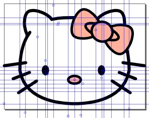
Hello Kitty!


Wow.  That was a lot more work than intended.  Hope you love the vector Hello Kitty!

Tuesday, November 23, 2010

Draw a pumpkin using Inkscape


Well; it is almost Thanksgiving and I love pumpkins so why not do a nice tutorial on how to draw a pumpkin.  My goal for this is to make the pumpkin look as realistic as possible.

To start, we will draw the basic pumpkin shape.  We don't want it to be a perfect circle, but to look realistic, we will make it somewhat random in shape. Use the freehand line tool to draw your pumpkin (turn smoothing up. I did 70). Play around till you get the basic pumpkin shape you want.

Basic Pumpkin shape
Once your shape is made, make a copy or two and put it to the side (we will use copies for coloring and texture).

Now for the creases.  Draw a single crease to one side so that it mimics the side of the pumpkin.

Single crease
Once the crease has been drawn, copy it and change the horizontal direction so it is opposite (press H).  Instead of making a bunch of creases, we will use Inkscape's interpolate tool.  Extensions>Generate From Path>Interpolate.  Choose the settings for the number of creases you want.  I do slight adjustments to the creases by hand to make it look a bit more realistic.

Try slightly uneven spacing to make it look more natural
That is the base for out pumpkin. Now for the fun stuff.

Before we get too far, we will create some layers to separate the different elements (OK... you probably don't need to do layers, but I am a lover of layers; it makes things easier if you want to create different layer blends in the future).

For my layers I am going to create a Base Pumpkin Layer and a Creases Layer.

We will get the base pumpkin color.  Pick something orange. Do a gradient... have the lighter gradient where you want your artificial light to be (in my case top left) and darker where you want the shadows to be.

Color is important but gradient is not too important. We will be adding more highlights and shadows later
Now we want to do some basic highlights and shadows. I am going to turn off my creases layer so they don't get in the way. I think I will go ahead and create a new layer for this as well (this way I can put a blur on the entire layer and not specific elements).

Highlight on top, then shadow, highlight, shadow

Right now it looks pretty goofy.  That is fine.  We will play with the opacities and blurs until it looks right.


OK. It is looking better. Not awesome yet, but good enough for now (we will change it later if it needs to be tweaked).  Let's get to work on the creases.


Get the first crease and copy it twice.  With the two copies, combine the two paths (CTRL + K) then join the nodes together at the ends.

Two crease shapes

Once you have combined the paths and joined the nodes, you should have a shape. Copy the shape.  One of the shapes will be the shadow, the other will be the highlight.  Combine the shapes and tweak the nodes so they line up on the nodes but don't overlap the shadows and highlights.  Look at the finished product below.


Now use gradients to create highlights. Black highlight on the left, white on the right.

 Go ahead and finish up the rest of the creases doing something similar. Focus more on the shadows than the lighlights.  Remember... we have the light to the upper left, so the creases to on the right of the pumpkin will not really have any highlights. 

After I finished the creases, I moved the highlight and shadows layer so they are on top.

Now we want to give the pumpkin some texture.  Remember some of those base pumpkin shapes that we copied at the beginning then set aside? Let us grab one of those now to use for our texture. 

I created a new layer and called it the "Texture" layer. I but it right above the base pumpkin layer. We will put our texture on this layer.  Make your shape a nice dark orange color (no stroke) then apply the rough paper texture (Filters>Texture>Rough Paper).

That is pretty good, but we want the shape to be more like the pumpkin and we want the texture to be a bit finer.

Open the filter editor (Filters>Filter Editor) and for the rough paper filter, take the scale all the way down for the displacement map.  Turn up the turbulence just a bit more.

Put the layer mode on "Screen" then turn the opacity down somewhere from 10-30%


Good enough for now.  Starting to look like a pumpkin. Let's do the stem!
Create a new stem layer.

Do a stem shape and give it a gradient.  I did mine a dark green/grey color on top and tan near the bottom.


Once you have the stem in place, give some highlights and shadows to make it more realistic.  You may want to also give it some texture like you did with the pumpkin.


That is basically it!  I am not totally satisfied with the look though so I think I will do some embellishments.   I think I will start by doing some shadows underneath the pumpkin.  Yep; going to do a new layer for that!


I think I will add a few more highlights to get it looking a bit better.....


Not perfect, but it looks like a pumpkin!

Thursday, November 18, 2010

Creating a business card using Inkscape


If you are in the design business, a business card is a great way to show off your level of professionalism.  No one will take you seriously if you claim to be a designer but use an inkjet printer with some business card template cutouts.  I will try to make this look as legit as possible.

This tutorial will be for a simple design that looks like it was created by a designer.  The idea for this comes from a great photoshop tutorial.


To start, we will change the document properties in Inkscape so the entire document is same size as the business card.  Standard size is 3.5" long and 2" high.  We will make it portrait.

Now for our business card we will do a background texture.  We will go for a grunge look and use a concrete texture.  Do a Google image search for "concrete texture" and hundreds of great images will come up.  The image I will be using is from imageabstraction.com

Go ahead and drop the image into Inkscape.

The image you just downloaded is going to be much bigger than the business card so we will want to shrink it down.  Also; the size is not going to be the same as what we want so what we will do is create a white rectangle the same size as the document settings and place the rectangle over the image in an area you think looks nice.


Once you have the rectangle where you want it, select both the rectangle and the image (hold shift while selecting) then click Object>Clip>Set.


Now we have the background base for our business card.

The concrete background is nice, but a bit too light.  Let's darken it a bit. Create a black rectangle the same size as the background; place in directly underneath the concrete texture, and bring the concrete texture opacity down to about 30%.


I created layers for the backgrounds, but you don't have to.

Sweet. Now we have a decent background.  That is fine how it is;  we want to keep the card simple, but we will add a design element. Staying with the idea of concrete, we will create a spray paint stencil design.

For this, think of a single word you want your card to convey. It could be your name, what you do, an emotion etc...   I have kind of been having a love affair with Inkscape recently, so I will use that for my word.

Go ahead and create a new layer.  Call it stencil text, and write your word on there somewhere.  Create a box to go under your text.


You will want to select the text then apply Path>Object to Path. Once that is done you will ungroup the letters then apply Path>Difference to cut the letters out of the rectangle. (make sure you have both the letter and background selected when you do this. Unfortunately [unless someone knows a better way] you have to do this one letter at a time)

With that completed, go ahead and change it to white and place it creatively on the card.


Once the stencil text has been added, go ahead and lower the opacity (I did mine to 20 or 30%). I also blurred mine just slightly.

To give this more of a faded grunge look, we will freehand draw around the new stencil. Apply the filter inkblot to your new drawing (Filters>Textures>Inkblot) then change the layer mode to screen. Once that has been done, create a rectangle to clip the new object. (See pictures below)
Freehand draw the border.

Apply the Inkblot filter
Set layer mode to screen
Now clip the section.
Fun!
Now let's add a vignette.  Create a new layer; call it vignette and draw another rectangle.

Do a radial gradient for the rectangle and have the middle be completely transparent and the outside edges dark. Have it placed directly over everything else.

Now create a new layer and call it "Text."  Here we will add whatever works.

Add what text you would like.  Here is what I did:

Do the back and you are done!